Wasting Time with Fonts
I have always wanted to be a writer, except when I reflect on the fruits of any labor, I find that my catalog of work is severely lacking.
Why? Well, I’ve just never found the right font to use.
It’s one of the reasons I identify with Hamlet: my indecision to take any action is a slow-moving tragedy. Except in my case, nobody is being poisoned in the end.
According to the great American writer T.S. Garp, a writer writes. I truly believe that, except over the years I’ve duped myself into believing that a writer needs the proper tools to carry out this task. So for years, I pondered composing some literary masterpiece either longhand or with a computer. I carefully researched the right journal to use: one that could lay completely flat on a desk. It had to be unruled paper, of course, because I envisioned my papers being pored over in the years following my tragic death for corrections or emendations to my heartbreaking works of staggering genius. Then I needed to decide if a fountain pen was necessary, or at least something other than a Bic pen. While I liked the little leather journals with the single strap to keep it closed, I ultimately opted for Moleskin’s awesome line of journals.
I figured that notes in longhand were far more romantic, you know, than opening files on a computer. But my handwriting is shoddy, and when you’ve grown up being distracted by ten million things going on around you, the ink doesn’t flow as fast as when you’re typing as quickly as the thoughts are coming. So I have about seven or so, mostly blank Moleskin journals in my desk drawer.
Okay, so I decided to just buckle down and use the computer. What program would I use? Everyone hated Word, but everyone used it. If I wanted to be an artiste, I had to use something that would be functional but where I could also flip Microsoft the bird and say, “I am my own man! I don’t need your product to compose my thoughts!” (But I kinda do like Outlook.)
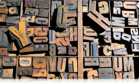
Now, after that had been decided, it all boiled down to the right font. I love typography. I like design. I go through print and art magazines looking at how people use different typefaces to make their statements and express themselves. I appreciate graphic design and like to fancy myself a designer, but that’s an affectation like the slight accent I use when I try to pick up girls. And I was really committed this time to exploring some ideas I had percolating in my head and finally get down to the business of writing. For me, that meant using the right font that would show who I am. It would be my identity. If I ever got lucky enough to get a book published, I would insist on being part of the book design. If I was really lucky and could get a two-book deal, then I would want to establish a signature typeface that would be used every time. Yes, I know that’s really getting grandiose, but I’ve come away from years of learning to love good design and creating a brand, that I wanted that to be part of the creative process.
I’ve always admired those writers and musicians who take the time to craft a piece of work that is its own universe. It’s why I’ve always liked Prince. Here’s a guy who can record an entire album before lunch, but that album has a unifying theme, look and attitude across the tracks. I was more than just a “Purple Rain” fan, and I eagerly looked forward to each year’s new release to see what world he came up with. What new catch phrase was he using? What was he trying to say? Whether or not you like his music, his ability to create something that reflected a particular theme was (and is) very inspiring. So I thought I could use that in my own writing career: the final product would have a single look, but I’d establish my typeface theme across as many works as possible.
I think the technical term for this putting the cart before the horse. Or insanity. Maybe both.
I know that there is this huge gap between what I dream about and what is actually possible, but I like to think of it as a guiding principle for how I wanted to do my work. Whenever I’m in the bookstore, I always look at the typeface of a book and if I like it well enough, I’ll purchase it and spend months deciding if I should use it. I’ve fallen in love with Fournier, Adobe Caslon, Janson Text, Requiem, you name it, I’ve bought it.
And there’s the rub: I don’t know which one to use.
Along the way, in my obsession with type, I’ve forgotten to write. I’ve forgotten how hard it is to write clear, polished prose because I’ve wasted so much time examining a paragraph of gibberish to decide which looks best on printed paper. In short, I’ve driven myself mad with the idea that any of this matters. I have lost the cardinal rule: a writer writes. Doesn’t matter if it’s on a scrap of paper, a journal or some obscure word processing program. If you have something to say, say it. Dithering about typeface? Seriously?
A friend of mine once told me that either I was afraid to succeed or afraid to fail. Right now, I have literally wasted close to ten years with this ultimately fruitless task. (Okay, a few things have also happened in that time, but you get the point.) And maybe I just don’t have that much to say, and have been using the Great Typeface Hunt as a way to cover that up. Either way, I have to paraphrase the words of that other great American writer, Jenny Fields: either afraid to succeed or afraid to fail, I’m fast on my way to becoming one or the other.